Service Call Intensity
The Service Call Intensity graph (Views > Service Intensity > ...) displays the number of Service Calls over time. This view allows you to find hot spots—areas where many service calls made. The individual kernel services are color coded using a separate color scale, shown in the right-side legend. You can toggle the visibility of kernel services in this view by clicking on the labels in the legend.
There are four available views:
- Service Call Intensity (By Actor) - All Objects
- Service Call Intensity (By Actor) - Select Object
- Service Call Intensity - All Objects
- Service Call Intensity - Select Object
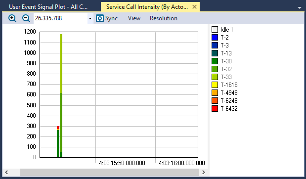
The Service Call Intensity (By Actor) - All Objects view
View Options
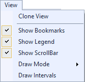
The View menu contains several options that allow you to change the graph’s display and content.
| Menu | Option | Description |
|---|---|---|
|
Clone View |
Creates a duplicate copy of the view in the same window. |
| Show Bookmarks |
Toggles display of bookmarks |
|
| Show Legend |
Toggles display of the color legend. |
|
| Show ScrollBar |
Toggles display of the scrollbar. |
|
| Draw Mode |
Choose a draw mode:
|
|
| Draw Intervals | Toggles display of intervals in the graph. |
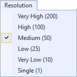
Resolution Options
| Menu | Option | Description |
|---|---|---|
|
Very High (200) High (100) Medium (50, default) Low (25) Very Low (10) Single (1) |
Determines the number of intervals to display. For a more detailed graph, increase the number of intervals by selecting a higher resolution. |
Related Topics ABOUT TRACEALYZER:
- About Tracealyzer
- Terminology
- Understanding the Tracealyzer User Interface
- Configuring Tracealyzer
- Tips, Tricks, and Notes
rELATED tOPICS ABOUT MONITORING:
