Service Call Intensity
The Service Call Intensity graph (Views > Service Intensity > ...) displays the number of Service Calls over time. This view allows you to find hot spots—areas where many service calls were made. The individual kernel services are color coded using a separate color scale, shown in the right-side legend. You can toggle the visibility of kernel services in this view by clicking on the labels in the legend.
There are four available views:
- Service Call Intensity (By Actor) - All Objects
- Service Call Intensity (By Actor) - Select Object
- Service Call Intensity - All Objects
- Service Call Intensity - Select Object
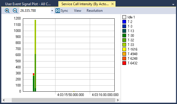
The Service Call Intensity (By Actor) - All Objects view
View Options
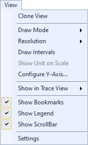
The View menu contains several options that allow you to change the graph’s display and content.
| Option | Description |
|---|---|
| Clone View |
Creates a duplicate copy of the view in the same window. |
| Draw Mode |
Choose a draw mode:
|
| Resolution |
Determines the number of intervals to display. For a more detailed graph, increase the number of intervals by selecting a higher resolution.
|
| Draw Intervals | Toggles display of intervals in the graph. |
| Show Unit on Scale |
Toggles display of the unit on the scale, if the current data supports the unit. If the data does not support the unit, this option is grayed-out. |
| Configure Y-Axis... | Opens the Configure Y-Axis dialog, through which you can choose an automatic (default) or manual setup. |
| Show in Trace View |
Show this data in the current Trace View or create a new Trace View to show the data. |
| Show Bookmarks |
Toggles display of bookmarks |
| Show Legend |
Toggles display of the color legend. |
| Show ScrollBar |
Toggles display of the scroll bar. |
| Settings | Opens the View Settings dialog, through which you can set current and default settings for this view. |
Related Topics ABOUT TRACEALYZER:
- About Tracealyzer
- Terminology
- Understanding the Tracealyzer User Interface
- Configuring Tracealyzer
- Tips, Tricks, and Notes
rELATED tOPICS ABOUT MONITORING:
- Application Monitoring
- Understanding Persistent vs. Transient
- Changing Default Monitor Settings (RTX64 Control Panel)
- RTX64 Monitor
- Event Classes
