Kernel Service Call Intensity
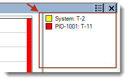
The Kernel Service Call Intensity graph displays the number of Kernel Service Calls over time. This view allows you to find hot spots—areas where many kernel service calls made. The individual kernel services are color coded using a separate color scale, shown in the right-side legend. You can toggle the visibility of kernel services in this view by clicking on the labels in the legend.
_745x496.png)
NOTE: Some of the view modes use a stacked display, while others contain lines that are not stacked but are overlaid one atop another.
Menu Options
| Views Menu | Option | Description |
|---|---|---|
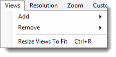
|
Add |
Add a view to the current view. Multiple Kernel Service Call Intensity views are available:
|
| Remove | Remove an existing view from the current view. | |
| Resize Views To Fit | Resizes all views to fit the current view window. | |
| Resolution Menu | Option | Description |

|
Very High - 200 High - 100 Medium - 50 Low - 25 Very Low - 10 Single - 1 |
Determines the number of intervals (data points in a line graph or bars in a bar graph) to display. For a more detailed graph, increase the number of intervals by selecting a higher resolution. |
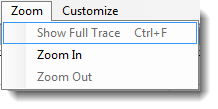
| Zoom Menu | Option | Description |
|
Show Full Trace | Displays the full trace in the current view. |
| Zoom In | Zooms in on the current view. To focus on a specific area, click and drag to select an interval. | |
| Zoom Out | Zooms out of the current view. To focus on a specific area, click and drag to select an interval. | |
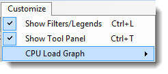
| Customize Menu | Option | Description |
|
Show Filters/Legends |
Toggles view of the actor view filters and legend.
|
| Show Tool Panel |
Toggles display of the Tool Panel.
|
|
| Display Options | Description | |
|
Various options for customizing the display of the current view. Each view contains its own Display Options icon (shown at left are the display options for the CPU Load Graph view) . Note that the options available from this menu will vary depending on the graph/view. | |

Time Region
A gray rectangular outline indicates the time region that is currently displayed by the Trace View. As the Trace View zooms in and out, this rectangle updates dynamically to mark the current region.
NOTE: You can combine this view with other horizontal views by choosing Views > Add > (graph type).
Related Topics about the Tracealyzer User Interface:
Related Topics ABOUT TRACEALYZER:
- About Tracealyzer
- Terminology
- Understanding the Tracealyzer User Interface
- Configuring Tracealyzer
- Tips, Tricks, and Notes
rELATED tOPICS ABOUT MONITORING:
